

By Pete Holley, Head of Measurement, Realtime
If you’re an analyst or a marketing professional with no background in statistics, the world of data can be intimidating. There’s so much of it, and it’s presented in many ways, and explanations often seem to make things more complicated than they need to be.
Sometimes that’s because people are bad at explaining these things clearly, but sometimes understanding data is genuinely complicated. People say “if you can’t explain something simply, you don’t understand it”, and while that’s a useful way of encouraging people to keep things simple, it doesn’t really apply if you’re trying to explain a concept that sits on top of a mountain of prerequisites to someone who has never climbed that mountain. If Einstein tried to explain general relativity to the average person – in full, not just the SF snippets – he would need to explain tensor calculus, but first he would have to explain what a tensor is to most people. These things take time.
If you haven’t climbed the mountain of statistics, where should you start in understanding data? It’s often a good idea to start by summarizing that data. Sometimes people will give you a few summary statistics to tick this box. In extreme cases, they’ll just quote an average, usually the arithmetic mean. But although this is useful, it’s definitely not the whole story. You can also learn a lot from the distribution of the data.
For example, imagine we are selling a product which costs $10 a unit. I might tell you that for the last month, our average sale was $112. That’s useful information for many purposes. But you will get a much better understanding of what’s happening if you look at the distribution of the data. You can do this with a frequency table, or, even better, with a histogram, how many orders appear in each of a number of categories– for example, 0-10 units, 11-20 units, 21-30 units and so on. This is important, because the shape of the distribution tells you a lot about people’s behaviour – or at least, it generates testable hypotheses about their behaviour.
Depending on the distribution, you could get more useful information from other summary statistics, like the mode – the most common value. This can be a better indicator of people’s typical behaviour than the average.
Let’s go back to our $10-per-unit example. Each customer can order as many units as they like. Let’s look at some possible distributions of your sales for a month where you sell about 553 units. The average (or arithmetic mean) of each of these distributions is the same; if you just considered the mean as a summary statistic, you couldn’t tell them apart. But the histograms could tell a different story.
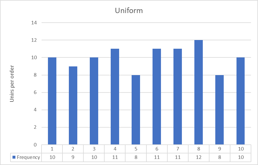
Figure 1
The histograms show the frequency of the various sizes of order. For example, 10 customers ordered one unit, 9 customers ordered 2 units, 3 customers ordered 10 units and so on.
This histogram shows roughly the same frequency in each category; it approximates a uniform distribution.
But what if the distribution looked like Figure 2?
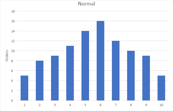
Figure 2
This is a so-called normal (or Gaussian) distribution. Most orders are around the average size, and the further the order size departs from the average, the less common it gets. Statisticians are very fond of this distribution because a lot of statistical techniques have been developed that depend on it. (You can sometimes use these techniques even if the distribution is not normal, due to the Central Limit Theorem.) But if you don’t want to get that technical, you can still get useful information from this distribution. In this example, 41% of customers order between 4 and 6 units, and 72% of customers order between 3 and 7 units. You could use this information, for example, to inform your decisions about what size and quantity of packaging to order.
Conversely, your distribution might be bimodal, like Figure 3:
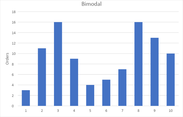
Figure 3
This distribution has two most common or modal values, which you can see as peaks in the graph. Here, only 19% of customers order 4 to 6 units, and only 60% of customers order between 3 and 7 units. Only a few customers order the average number of units. Compared to a normal distribution, you would have a much greater need to accommodate orders which were much smaller, or much greater, than the average. You might also want to consider if you need different marketing personas, or even channels, for low-volume and high-volume clients.
Sometimes distributions can lead to obvious conclusions as well. For example, consider the distribution in Figure 4.

Figure 4
We can see here that there are orders for 6 units and 8 units, but none for 7 units. If you saw a distribution like this – especially repeated for several months – you might want to look at your website and make sure that it’s actually possible to order 7 units, or consider whether there is an incentive for customers to order 6 or 8 units that doesn’t apply for 7 units. (If only all analysis were that simple…)
So what can we conclude? While means are helpful in many cases, they don’t always give you all the information you need to make marketing, budgeting, or even staffing decisions. Try looking at distributions, and see what you and your team can learn from them.